
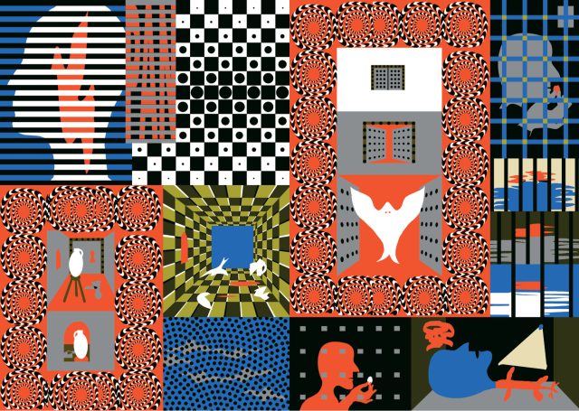
I've often wondered about the capacity of dreams to inform and color our real lives. I've had vivid dreams for most of my life, and they often bleed into the early hours of the morning. Chris Harnan's Big Pool feels like a waking dream. It weaves in and out of color and black-and-white sequences with offset fluorescent CMYK and gray Pantone spot color. It's as much a fine art project as it is a comics narrative. There is a playfulness and complexity to Big Pool that invites interpretation, and rewards it.
Chris is originally from England, and now lives in Sydney, Australia. His first book, World Problem Solution Book, was published in 2017. Big Pool was released in the summer of 2025 by Breakdown Press in the UK, and Fidèle Editions in France.
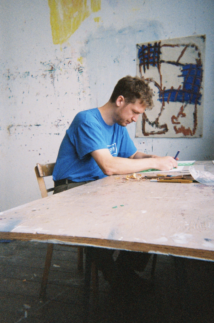
In late January 2026, Chris and I caught up on a video call to discuss his book. His parents were visiting him in Sydney, and I was wrapping up work in Vancouver.
_____________________________
CAIL JUDY: How did you first come to making art?
CHRIS HARNAN: My very first influence when it came to making images was animation. I made Flash animations when I was young. They were super rough at first, but they eventually became purposefully anti-technical, and that was what initially drew me toward making sequential images. Online animation and forum communities were probably the biggest influences on me then.
Before that, I was always into drawing. Beano was an early comics influence, England’s Dennis the Menace. He has dark hair and he’s a mean, horrible kid.
I had a general interest in drawing when I was young, but I got a computer when I turned 11 and then I became glued to it. It was web comics that got me. Have you ever read Dinosaur Comics or Perry Bible Fellowship?
Perry Bible Fellowship, big time. Those were kind of mind-blowing when they were coming out in the early 2000’s.
That was probably my first real “oh, I like comics” moment.
Then I got into Flash animation, and it was all about scale. Being on these forums was about trying to impress the other creators. It was all built on super small communities.
For example, Newgrounds. Do you know it? It was this upload portal for Flash animations. There was a screening process by the community, where everyone voted zero to five on every video, and if a video got below a two average, it got deleted. So you’d work on something for ages, put it up for screening, and you’d either make it onto the website or not. Trying to figure out what people liked there was the whole thing. Initially, I used sprites from video games, so no drawing on my side, I just moved them around in Flash. There was a complete untechnical approach to these animations, where it was like playing with toys. I was just bumping these images together. Eventually, it became drawing, but always without a drawing pad, just super basic mouse stuff.
Then it got weirder as I got older. In these communities, there were people who were doing work that was purposely meant to be bad. As it grew, there were people posting animations who aspired to work for Cartoon Network or Disney, and then there was this group who were stuck to the animation being ugly, and still trying to get the worst shit posted on the site. And that’s where I ended up. *Laughs*
Is there a specific one you remember that sticks out to you?
An animation? Well, I was part of a group called The Clock Crew. It started with one guy who called himself Strawberry Clock, and I know this sounds really lame, but it got big enough where it earned this gravitas. I think it genuinely meant a great deal to a lot of people in this tiny corner of the internet.
Strawberry Clock uploaded a single frame from an animation to this portal, just a red letter “B” in Times New Roman, and he got it onto the website. “Religion” would be stretching it, but followers started to grow around this idea of “we’re going to upload crap and piss off the people taking these animations seriously.” It was fueled by a lot of people, lots of teenagers, and there was a level of “we’re just fuckin’ around” to it, but it grew, and more and more people joined this movement. It started to develop its own sense of what was good and bad. This was all happening years before my involvement.
When I joined, I was trying to make something good within this weird set of rules. The Clock Crew animated inanimate objects in stories. Some of the early stuff had this surreal element to it. Eventually, it had a lot of rules and a level of quality, but it was always inanimate objects being moved around a screen, talking to each other in robot voices. It got to the point where people were animating Lord of the Rings with these inanimate objects. They were genuinely skilled animators, but there were these strange surreal rules that had been set. That’s what I spent my teenage years doing.
I saw you were a big part of Brand magazine’s 77th issue. In that issue, you said you’re more comfortable working with computers than analog materials. Looking at Big Pool, it has so much tactility, clearly there’s digital and analog elements in your practice. Is your experience with Flash part of why you’re more comfortable creating digitally?
Yeah, even during that early time, Flash is what I'd do at home for fun, then I’d go to school and do fine art sketching. I still cared about the fine art, but there was always an element of “you can do whatever you want” when I got home. There was a quantifiable “I’m trying to achieve something” in both, but it was more free on the computer than “I need to learn how to shadow in pencil,” things like that. I’ve always found the computer side more interesting. Eventually, I learned I could take that attitude to more traditional work, but at the beginning, that’s what computers gave me. I got quite good at using them.
The constraints allowed you to flourish, like the rest of the Clock Crew. Did you go to school for fine arts?
In high school, I took art classes, then I went to university for illustration.
When you were studying illustration, were you experimenting in this mode you have now? Did you have an idea of the illustration you wanted to achieve?
I went to university thinking I was carrying on my school work, which was traditional media. I fell into illustration without knowing how I’d apply it in a real-world context. I was getting good feedback on my work, but I never thought the stuff I was doing on the computer was something viable. It was always a hobby.
I had good teachers at university who saw what I was doing, and my hobby started to bleed in more and more. It took me a while to realize this was my main thing.
After university, I did part-time work in illustration. The book I released in 2017, World Problem Solution Book, came out then and it was similar to how Big Pool started. I grouped together work I’d made over a long period of time, and it began to take form.
I went to Germany for a year to be an intern graphic designer, and that was just before World Problem Solution Book came out. That was a big moment for me. I met lots of people in Europe, lots of comic people. Part of me was still “am I a graphic designer? Am I an illustrator?” but my visual style was cementing itself. I met people at university as well who introduced me to comics, but it was also my online community that led me to finding people who had similar attitudes about art and comics.
When I was promoting my first book after it was published, I got invited to go to France. I met the people behind Lagon Revue, an alternative comics magazine. They asked me to make a comic in my style for an anthology they were putting together. That was the first time I was like “this isn’t a halfway thing.” I’m not just hinting at a narrative. I’m making something with a start and an end, and I’ll call that a comic.
World Problem Solution Book is even more wishy-washy than Big Pool. I’m not giving much away at all in that book. There are things going on in my head that suggest a narrative, but I’m not letting on much. The Lagon Revue commission was me stepping into “I’m letting on a bit more.” It’s still not completely clear, but it was a big step in becoming a guy who makes comics.
Right on. What was that anthology called?
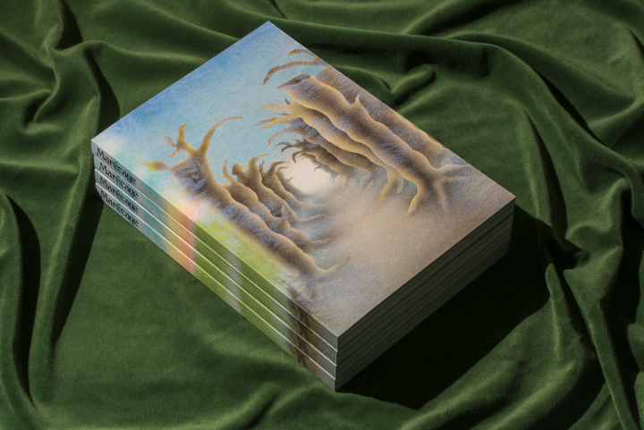
The one I was in is called Marécage.
Then I was in another one in 2022 called PLAINE. They’re really great. You should definitely check them out. They’ve released like seven at this point. The middle of Big Pool, the casino section, that’s a slightly adjusted version of that original Lagon Revue comic. That comic was ten pages, and it took so long to make. The way Big Pool looks now was me wrestling with how it should look for a long time. The Lagon Revue piece is quite a dour, self-pitying comic, and the rest of Big Pool came from that a few years later. I wanted to express lots of other feelings and emotions in the book. Joe Kessler from Breakdown Press met me and he was like, “We’d really like you to expand on what you did for that French comic.” So that’s how Big Pool came to be.
Getting cosigned by the French is great, they love comics.
You should really check out Lagon Revue. Their thing is they contact people who are on the edges of comics or have no association with comics, and get them to make comics. So you might like it.
And that was the official invitation you talked about earlier, the invite to start making comics.
Yeah.
When did Big Pool become a book in your head and not just a body of work?
Joe Kessler asked me if I’d like to make a much larger version of that comic. The original comic wasn’t necessarily just going to be plopped in there, but I knew that was where I wanted to expand. It’s based on my life and experiences. Lots of things that happen in the book are directly referencing events in my life.
I was picking out what stories I’d like to tell. Some of the stories are repeated in World Problem Solution Book, things I fixate on a bit. I frame that book more as therapy. This one is less so, but it’s me pushing out what happened in a way that isn’t completely clear. I’m protecting myself by layering it with different levels of abstraction. I’d choose events and think: “this is important, this isn’t, this is okay if it’s just a small panel that references it.” I gravitate toward certain things because I think about them a lot.
Toward the end, without being too specific, it all comes together as an expression of how much I’m thinking about them, how I’m becoming aware of my own fixations. When I first started, I wanted to weave a flow that connected these things. The point it became a book is when I set out the stories that I felt were relevant and represented other emotions. That was my goal.
If the original comic was self-pity and wallowing, I wanted Big Pool, in a rich way, to reflect other things that have happened to me. What I became more and more excited about as I made it was the flow of the entire book, and how the pieces fit, and how I wanted to generate momentum. I talked to Joe about making it feel like music, creating momentum, guiding the reader. You can stare at individual panels and infer meaning, but it’s also about the experience of going through it quite quickly and what it means to experience it that way. That was something I concentrated on.
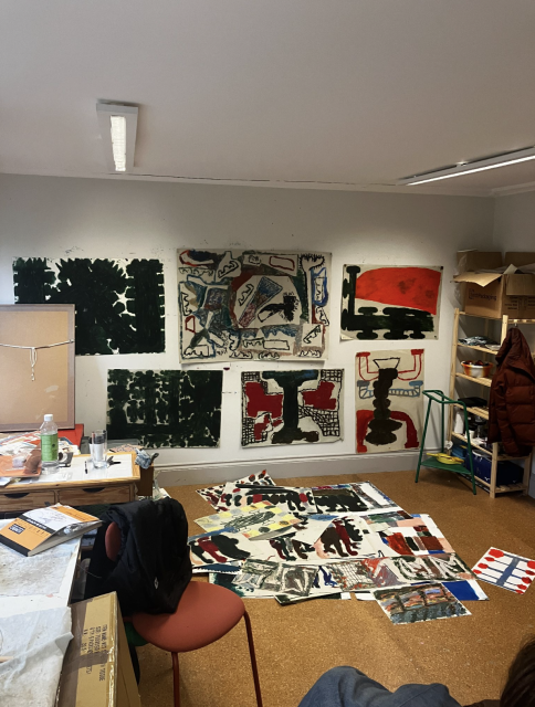
Were you working the structure out with sketches in a notebook, or doing a bunch of work and spreading it out on the floor?
Sketchbook planning wasn’t part of it at first, that came later. I had images laid out and I tried to emulate the experience of reading it, moving things around. As long as the key story blocks were there, I felt I could move things. There isn’t a through story that matters based on sequence or depends on order, it’s more a series of experiences.
Here’s an example. We’re in this section, which I love, the horizons, pictures of water and the birds. Birds come up a lot. Then we switch from color to this mode. Could you describe what you imagine the reader's experience to be going from this section to this section? Is it the end of one narrative and the start of a new one?
I think of it as a break both for the character and the reader. There’s been this onslaught of feeling, events have been coming thick and fast, and then suddenly the black and white on plain paper is an exhale. Things, to me, feel like they should slow down a bit. It’s like “that happened, and now we’re moving on to the next section.” It’s hills and troughs, it’s meant to be like that.
One of the cool aspects of the reading experience is it’s more of a ride at times. It’s sequential, but the narrative is perhaps thin.You play with the horizon a lot. One of my favorite things is the rooms, with the tiny door out into nothing. Can you speak to the horizon? So often it feels like you’re driving us toward a focal point, or we’re going down a road.
I’m constantly thinking about momentum and the character’s path. This is me moving on this journey.
Consistently throughout, I was imagining a character on their journey toward the end of the book. Horizon lines and panels that gravitate towards the center are ways of maintaining that. We’re experiencing this, but always within view, we’re moving towards the next point. It was useful for me to have a lack of features, me entering into a horizon, or a surreal landscape with things in isolation on this landscape. It’s a dreamlike set of elements in front of you, but you can always see what’s next. It’s a conveyor belt of experiences happening to you.
Is that how you view it for the reader, that the book is happening to them?
That’s how I experienced it. I put myself as the reader a lot, imagining the experience of this book. Other artists or authors might want us to enter into a clear setting. For me, I don’t find myself really doing that. I find myself putting things on a stage. I’ll maybe use a horizon line, “what is on the stage in this frame? What about this frame?”
We haven’t really talked about this, but a lot of where my work comes from is communicating things simply. I try to reduce certain elements, you see a lot of things as silhouettes, you see a lot of things as symbols, semiotics, you see things as understood representations of things, then I mess with that.
Silhouettes are a good way of simplifying. I put these things on a stage, maybe that even comes from Flash animation. I drop in representational things and that anti-technical thing is like “that’s good enough” and I do things to it. Does that make sense?
It does. A nice example is on this page with the hand and a circle, an eye, arrows pointing into a casino. The turtle is a silhouette but also a symbol of other things. You’re getting us to play with what a turtle means in this context now that it’s on the stage.
It’s a cool way to experience your work. What does a day look like when you’re making a sequence like this?
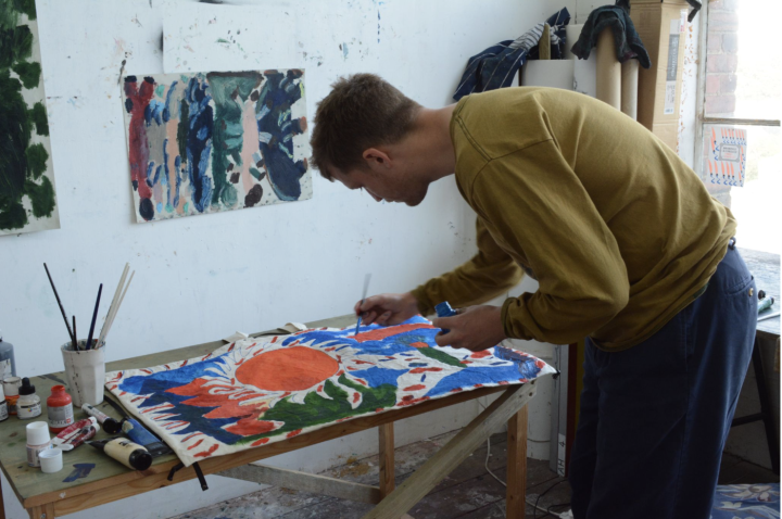
It’s important to note that there would be lots of drafts for a segment like the casino one with the dots on the black background. I might start with references for a casino backdrop, like the first thing I thought of was Akira, you know, the buildings shifting? But I want it to be way simpler, way more reduced. Then I’d get a photograph of a city and see how I can give a bit of depth in an interesting visual way, trying different shapes, making it not just seem like a mess of dots, communicating “this is a bunch of buildings.” Experimentation with different shapes. It starts as: “I have an interesting visual idea of representing this drunk guy walking.” I already had the gray character from a previous page, and he needs to be droopy and sad. I want to have fun representing this.
We’ve all been here.
*Laughs* You know that Simpson’s episode where Homer is drunk? There’s neon on a black background phasing, a montage, it’s a reference to a famous film I can’t remember. So my guy is drunk and lost; lost in his mind. So it’s me trying out lots of versions of black backgrounds with specks of color, doing it over and over again to visually communicate that feeling. That’s me, sitting at my computer.
So how do you come to the point where you’re like “this is the image done”? You’re so much about simplifying and subtracting. How do you know when you’re satisfied?
Often I overdo it, and I come back to previous versions where I’m like, “that was it, actually.” When I’m working, once I have a goal in mind, it can become mindless. I’m entering a state of “I’m just going to keep making versions of this.” I have a specific target, I know what I want to achieve, but the experimentation phase can be pretty mindless, so I’m throwing things against the wall, then I might go way over the top, and come back to it and say “Actually, this was the right level six hours ago” when it was very simple. But I’ll admit, it is hard to recognize when that sweet spot of “I’ve got it” happens. That restraint usually comes later.
I’ve always got my attention on showing restraint, but I’ll spend too much time making it look like the thing it looks like, or is meant to look like, then come back and realize “this is more in service to the level of dreamlike quality or abstraction I’m looking for.”
That’s well-said. Is there any specific work, painter, visual artist, or book you’d compare to Big Pool? For me, one that comes to mind is Max Ernst. Not visually, but in terms of combining images and meaning from juxtaposition.
Sure! That’s not my reference, but it’s great. I’m a big fan of Japanese alternative comics, like King Terry and Garo. They are examples of what I appreciate in terms of seeing what I can get away with.
What inspired me when I saw those comics for the first time is “what do people expect in terms of representation?” I ask myself how I can push my work in a way so people get something unexpected, but still understand it. I revel in “oh I’ve gotten away with this” in terms of what I’ve done to represent something. There are different styles in their work, but we’re similar in how we depict things in a straightforward manner.
When I still thought I was going to be a more traditional artist, I held a lot back in my work, and never completely stepped away from that. Even when I came to comics, I still haven’t given that up.
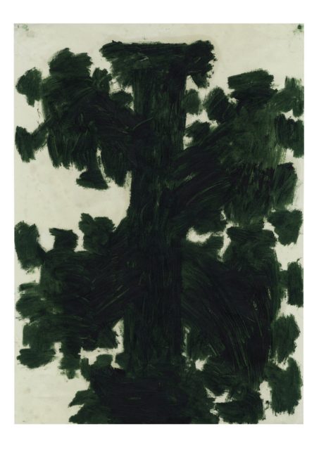
Would you consider Big Pool to be playing in the realm of abstract expressionism? There are sections that made me think of Rothko, especially near the end.
I think it does come naturally to me. Moving into comics, I had people around who encouraged that aspect. Say Joe Kessler, and my friend Erlend Peder Kvam, they encouraged refusing to give away the mystery.
What’s really cool about Big Pool is it’s hard to classify, but it’s clearly resonated. It was called out as one of the best graphic novels of the year in The Guardian, and it won the Award360°gold prize for illustration. Have you been surprised by how it’s landing with people?
Yeah, definitely. I’m most intrigued when it leaks into a traditional comics space. I randomly Googled it yesterday, as you do, and found a Reddit thread on r/comics about it, and I was a little apprehensive. I thought people might rip it apart because it’s not straightforward. Some people said, “I don’t understand this at all, it looks like my little cousin could make it.” But then some people were defending the narrative, it was great!
When I was outlining and putting images on the page, I would wonder, “at what point is this too much effort for the reader? Is it a complete mess?” I’m surprised and appreciative when people put in extra effort to decipher it.
How do you feel the printing and physical design of Big Pool play into the story?
When it comes to the story, I couldn’t see it being made any other way. The style of the book is based on that original ten-page comic in Lagon Revue. With their permission, I used the same type of printing. Jean-Philippe Bretin is the print designer of all the Lagon Revue books, and he designed the cover layout for Big Pool. In Marécage, the entire book has that offset printing style, but in Big Pool it’s only certain segments.
I see the printing as another way to guide the flow of the book. When we enter a new section of printing with color, it’s more dreamlike, it becomes more sensory. The black and white sections are more straightforward, like textbook recitals, “these are things that happened.” Whereas the dreamlike color sections go into sensory feeling mode, and are happening in big waves. I find you flick through them more quickly, at least I do. I'm influenced by films, so those color sections are like a flash of animation, a sequence of frames that are happening to you. The black and white sections are more formal, like traditional comics where it's a story being told.
With the sensory elements, there's less panels, there’s more full page imagery and it's washing over you more. There are different levels of intentionality, sometimes I'm battering you, I suppose. “Here's a trauma,” or “here's something that happened” and then you flow back into the black and white, where I’m connecting dots or being more specific. Sometimes, it can be more referential to the other sections with silhouettes, references, metaphors, symbols.
Do you have a favorite section, if you had to pick one?
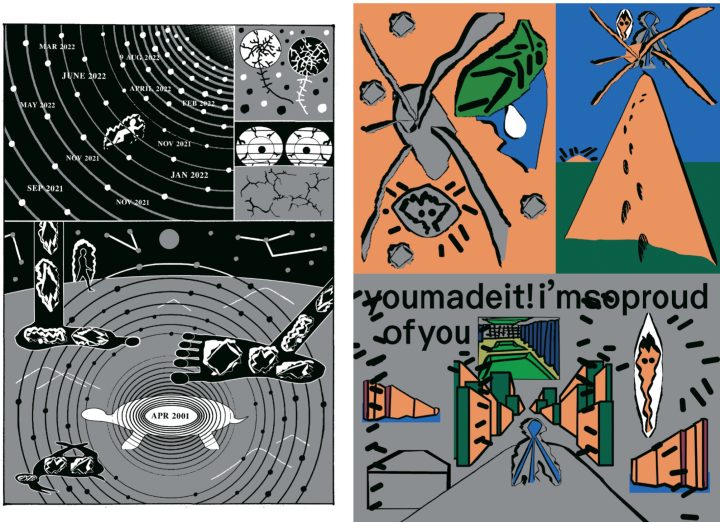
The third color section, at the beginning, when they reach the top of the mountain, it says stuff like “you made it." That's when the momentum is meant to peak and then kind of dissolve afterwards.
I was a bit worried about you reading that section. It’s sad, but it feels like there’s catharsis.
The language isn't completely clear, but I'd reached a point in my life where I was self-reflecting a lot and fixating on things. I met my partner after making the book, and now I've reached a different stage of my life. Big Pool is a representation of a bunch of years of feeling.
There was one specific thing I was curious about, the section where you have all these dates drop in. What happened in April 2001?!
*Laughs* I’m not going to say, but it is referenced in the book. I didn’t include the exact thing that happened on that date, but it’s relevant. One of the sections deals with it, but not the specific thing that happened.
I’d love for people to tell me what they think of the book, and how they interpret it.
Before we wrap up, what have you been reading lately?
I just read The Unconsoled. Have you read any of Kazuo Ishiguro’s books?
I’ve read Never Let Me Go, and a buddy just bought The Buried Giant the other day when we went to a bookshop.
Here’s a loose description of reading The Unconsoled: it’s a representation of what it's like to dream, to leave situations and spaces, interact with people, things that are not concluded, whims and impulses just end and start. That feeling, the nature of dreaming, he achieved in his writing. All the settings feel half described, everything feels symbolic, but not in a way that's interpretable. You go along for the ride. I enjoyed it for that reason.
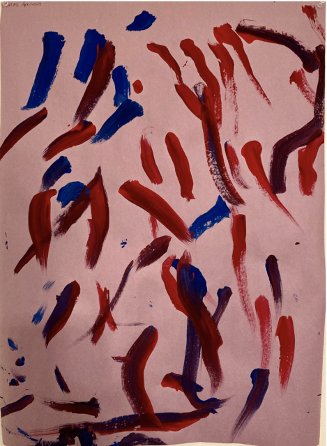
That’s a great recommendation. Before we go, can I show you one of my son’s pieces of art? He’s three years old and he’s got such a confident line. This is one he did like a year ago.
Oh, sick!
Isn’t that cool?
That looks so much like a cave painting. It’s so confident, I love it.
Thank you. What are you working on next? Another book?
Not yet. I'm definitely taking a break, but it's already in my head. I'm trying to push it away, there’s a feeling of “you should work on it,” but I'm enjoying not. I will eventually, and I've got ideas for stories. I think the next one will be less about me. We'll see where it ends up, but there will definitely be more comics.
The post Chris Harnan Makes a Splash with His Latest from Breakdown Press appeared first on The Comics Journal.


No comments:
Post a Comment